
Build a Simple Map in Tableau
December 4, 2020
Gauge Chart Implementation in Tableau
December 7, 2020How to Create a Donut Chart in Tableau :
Create a Donut Chart in Tableau : To create a donut chart in Tableau, it needs to calculate measured percentage values for a particular dimension in the reporting world, but this functionality is out of the box in Tableau.
Challenges to User/Developer-
https://www.dropbox.com/s/rg4yx1ail47g9md/Infofiscus%20Final.mp4?dl=0The above problem can be resolved with the help of the doughnut chart KPI.
Create a Donut Chart in Tableau This leads us nicely to the donut chart. Fundamentally, this is built on a pie chart but incorporates a space in the middle for the high-level takeaway figure. Interestingly, it often also makes the proportion of the slice slightly easier to read.
Solution
Approach-
Create a pie chart
Switch to the dual-axis chart
Change the second pie chart to a circle
Technical Solution –
Double-click on Rows and write avg(0):

In front of the field you just created, double-click, and write avg(0):

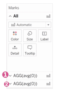
You should now have two Marks cards:
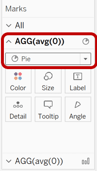
On the first Marks card (1), change the mark type from automatic to Pie chart:
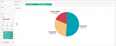
On the first Marks card (1), bring your dimension to Colour (e.g. Segment) and your measure to Angle (e.g. Sales):

Still on the first Marks card (1), bring the measure (e.g. Sales) and the dimension (e.g. Segment) to the Label card. Click on the Label card and select Show mark labels:
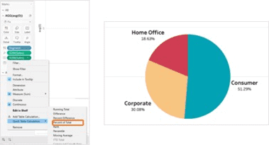
Create a Donut Chart in Tableau : Right-click on the measure (e.g. Sales) field that you just added to the Label card, and select Quick Table Calculation and then Percent of Total:
On the second Marks card (2), change the mark type to Circle. Use the Size and Colour cards to adjust the size and colour of the circle:

Again on the second Marks card (2), drag and drop your measure (e.g. Sales) to the Label card mark:
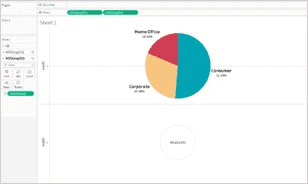
On the Rows, right-click on the second avg(0) field and select Dual Axis:

And there you have it! Now, you can visualize your data by building upon the pie chart whilst also providing key takeaway information to your audience.
Advantages-
In a doughnut chart, readers more often than not, focus on reading the length of the arcs, rather than comparing the proportions between slices. Also, doughnut charts are more space-efficient than Pie Charts because the blank space inside could be used to display data.
Conclusion-
When we are migrating from Qlik Sense to Tableau above solution will be more effective, the doughnut will be effective functionality in Qlik Sense so it is out of box feature in Tableau but it is achievable by following the above steps in Tableau.


