
Donut Chart Implementation in Tableau
December 7, 2020
Row Level Security In Tableau
December 7, 2020How To Create a Gauge Chart in Tableau :
To create a Gauge Chart in Tableau for showing whether data values fall within an acceptable range or not. If we have a linear range of progressive information and you want to depict how it changes.
Challenges to User/Developer-
The above problem can be resolved with the help of a Gauge Chart.
Gauge charts are extensively used in project management to define deadlines, modules, and related details.
Solution
Approach-
This gauge will show sales by Product Sub-Category relative to one another. So, we start with Sub-Category [Sales].
Technical Solution –
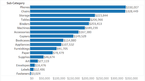
Then we must normalize sales to put it on a 0 to 1 scale. So, create a new calculated field using the following formula:
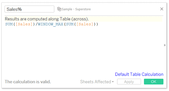
Which converts the scales from dollars to percentages normalized from 0 to 1.
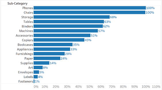
We will use this Calculated field (Sales %) to create the X and Y coordinates which point the gauge needle to a point on the circumference of the gauge. To create the X and Y calculated fields I use a parametric equation with the [Sales%] field above.
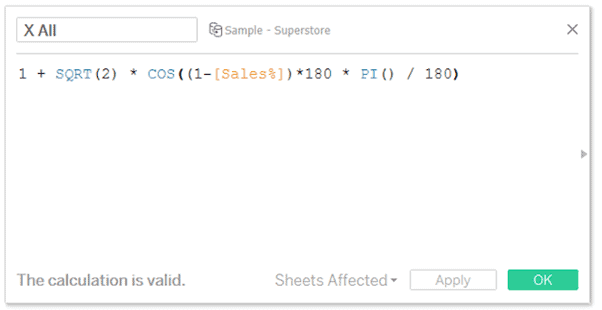
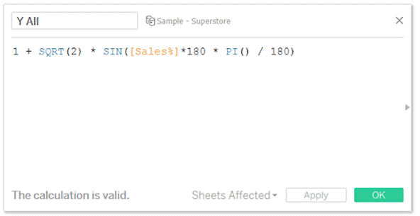
Sales x 180 essentially creates an angle such that the highest point is at 180 degrees and the lowest at 0 degrees.
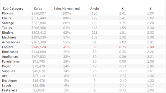
When you place [X All] in the columns shelf and [Y All] in the rows shelf then set the calculated field to compute using Sub-Category. All Sub-Categories are positioned from left to right, lowest to highest sales along the circumference.
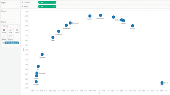
But we want a single point for each Product Sub-Category. To do this we will need a parameter to identify the specific point we want to show. So, we create a parameter called Sub-Category with the same fields as Product Sub-Category.
Then we need to tie our X and Y coordinates to this parameter to only show a single point. In addition to only showing the coordinates of the selected Sub-Category we also need a fixed origin point in this case 1, 1.
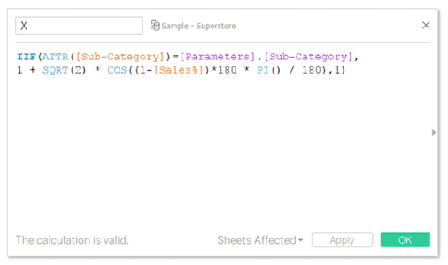
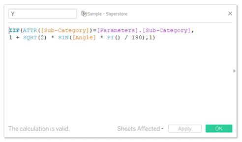
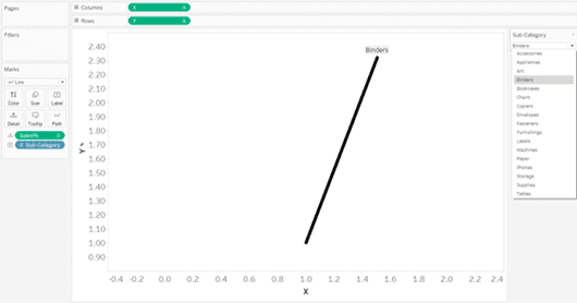
We place the new [X] and [Y] measures into the columns and rows shelves, respectively. Then set the calculated field to compute using Sub-Category and set the mark types to the line. The new point on the circumference is tied to the parameter and the rest of the points are placed at the origin point (1,1).
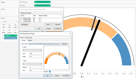
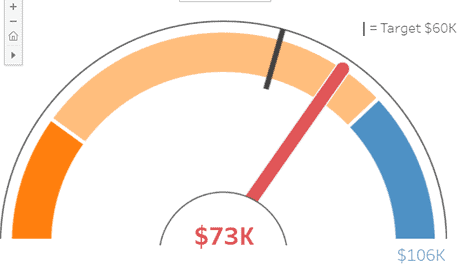
Add a background image with shaded reference points setting the X field to X and the Y field to Y. The left is set at 0.5 and the right at 2.5. The bottom at 1 and top 2.5.
Advantages–
A gauge is easy to read and understand and gives an instant indication of the performance within an area.
Conclusion-
When we are migrating from Qlik sense to Tableau above solution will be more effective, the gauge will be effective functionality in Qlik sense so it is out of box feature in Tableau but it is achievable by creating a calculated field in Tableau.


